Jetpack Compose themes
- Part one: Lists using LazyColumn in Jetpack Compose.
- Part two: Customize application theme using Jetpack Compose.
Themes are an essential part of application development as they provide a unique user experience. I will explain how to achieve this goal using Jetpack Compose -the new Android UI toolkit-.
Based on my experience with Compose, it noticeably helps reduce UI development time. We can use Material Design elements through Compose’s public APIs. Our focus in this blog will be on “MaterialTheme” which contains the color system, light and dark themes, the type system (typography), and the shape system.
If you want to read the Arabic version of this tutorial you can go there.
Step 4: Baseline Theme
The baseline theme is the default theme for all Android apps and it can be customized to give a unique experience for your app.
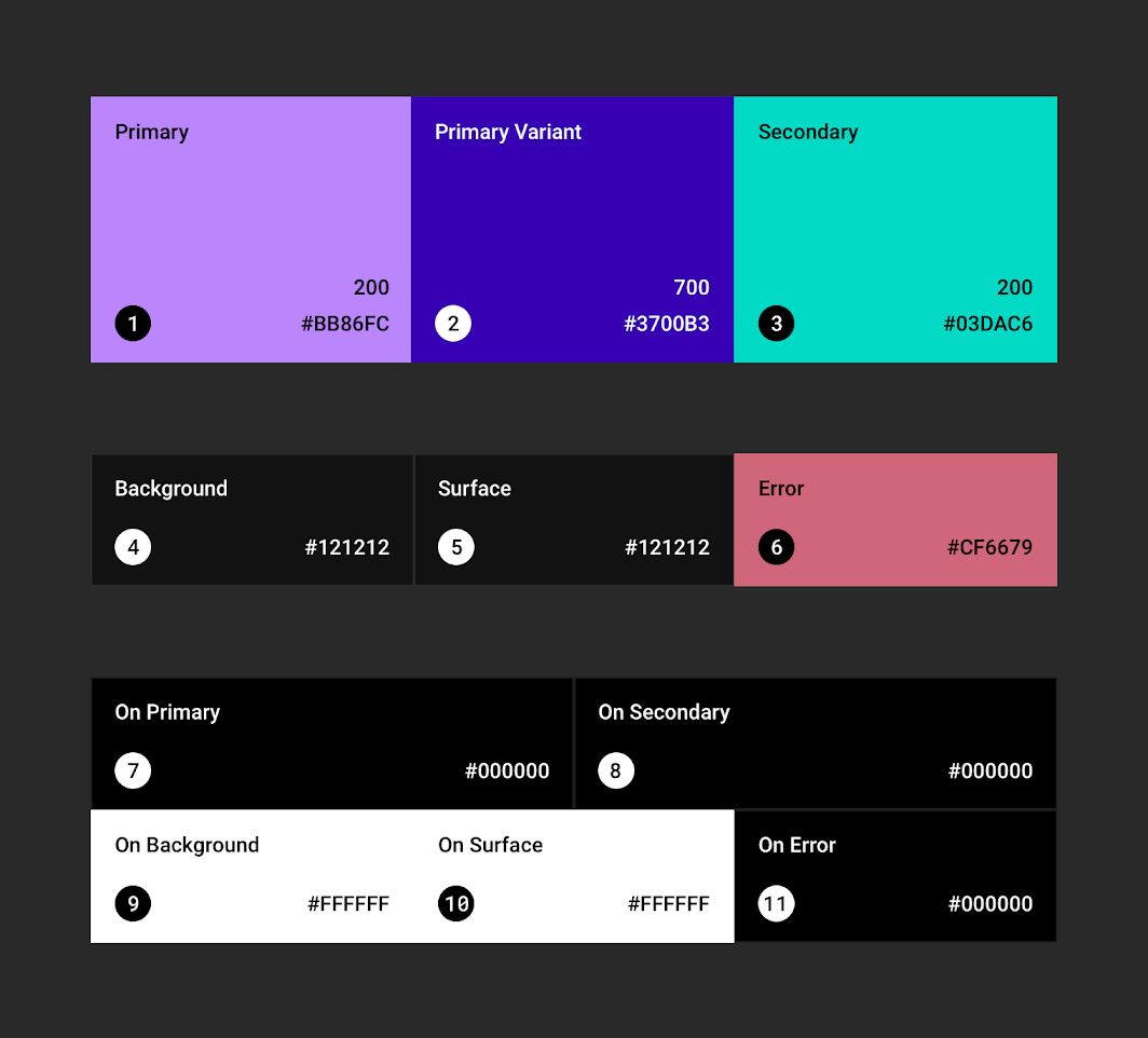
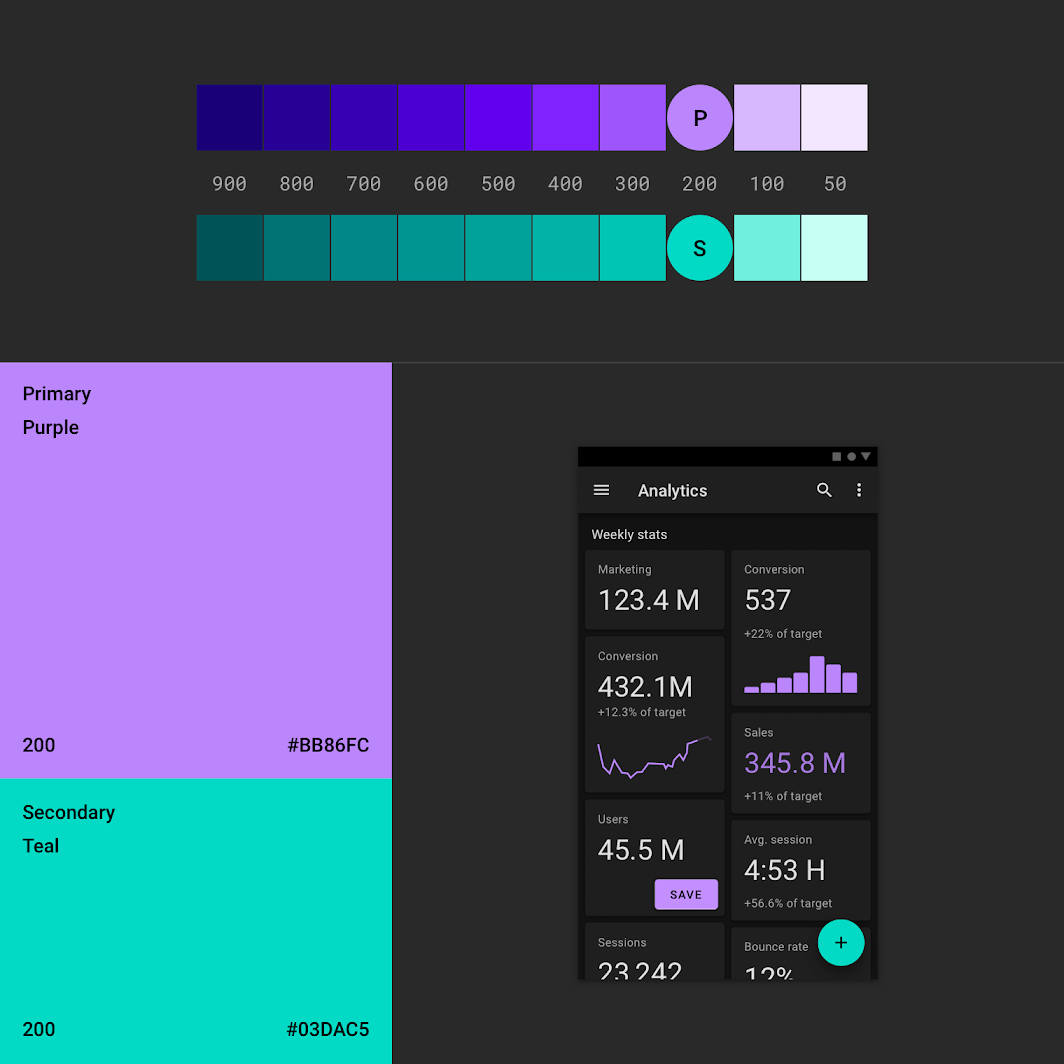
The colors in the baseline theme are violet as the primary color and turquoise as the secondary color with different shades for light and dark themes.
The below picture from Material Design shows the default colors in the baseline theme.
 The dark baseline colors | 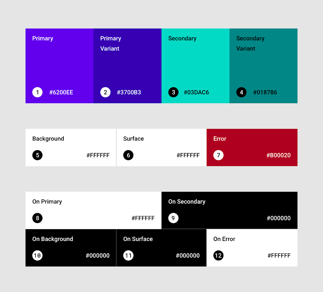 The light baseline colors |
|---|
In terms of typography, the default font is the Roboto typeface. Refer to the below image from Material Design.
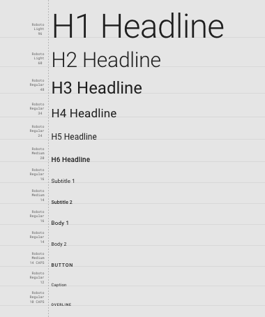
The type system
In the shapes, we have a rectangular shape by default, with 4dp rounded corners. Below is an image from Material Design.
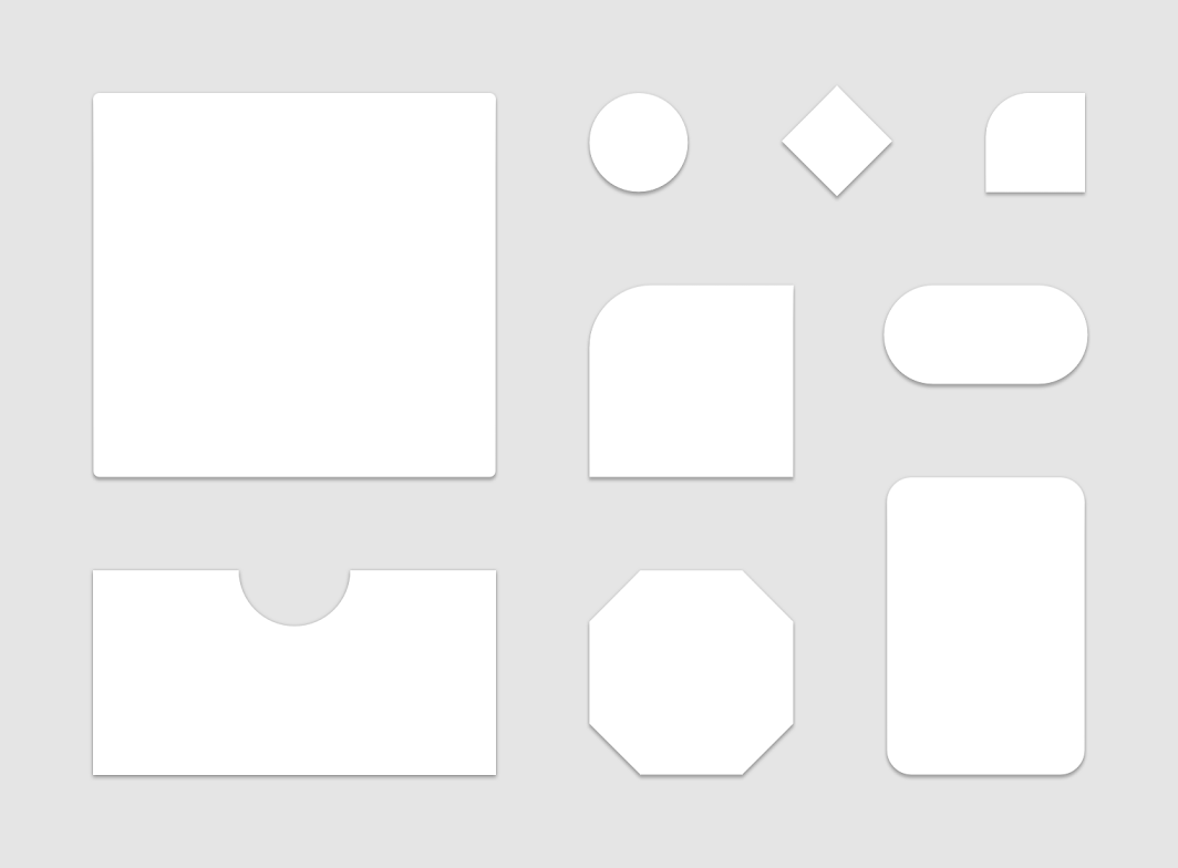
The shape system
We have night/dark and day/light themes, and in each one, the color scheme varies. Please, refer to the below image from Material Design to see the default colors for dark theme and light theme.
 The baseline theme for dark theme | 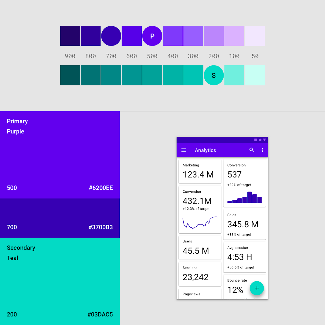 The baseline theme for light theme |
|---|
Note: Now, after introducing Material You, the baseline theme with dynamic colors drastically changed the Android UI experience for both users and developers. Therefore, most of the mentioned above do not apply to Material You.
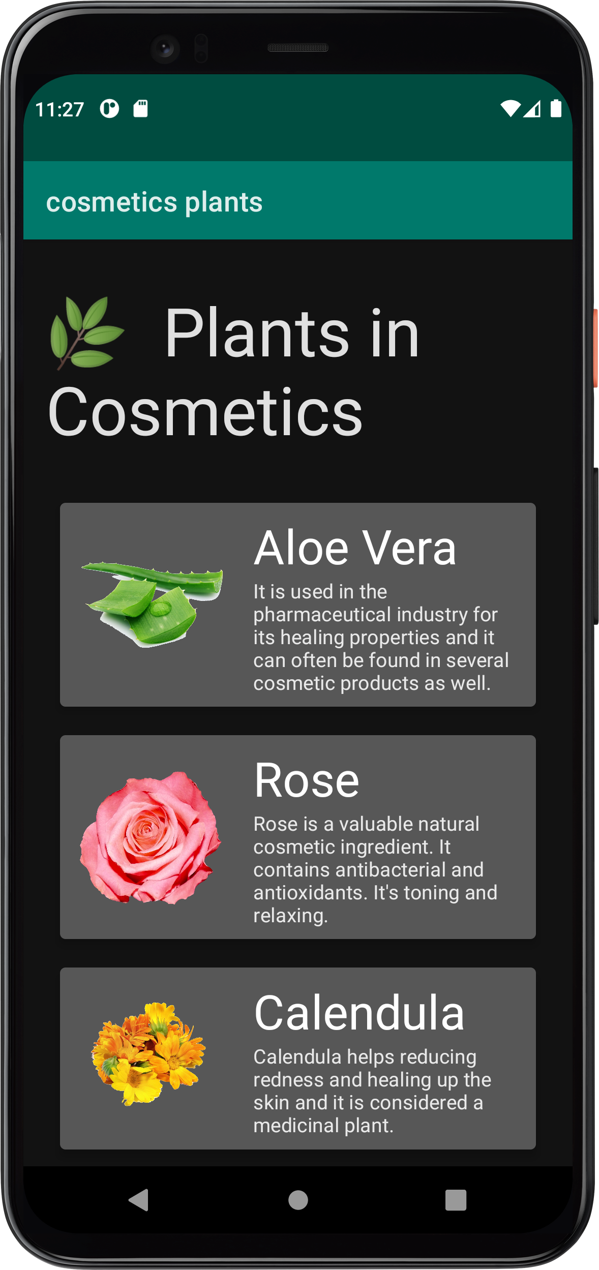
As you can see below that our plants app theme is the baseline theme. So, let’s change that!
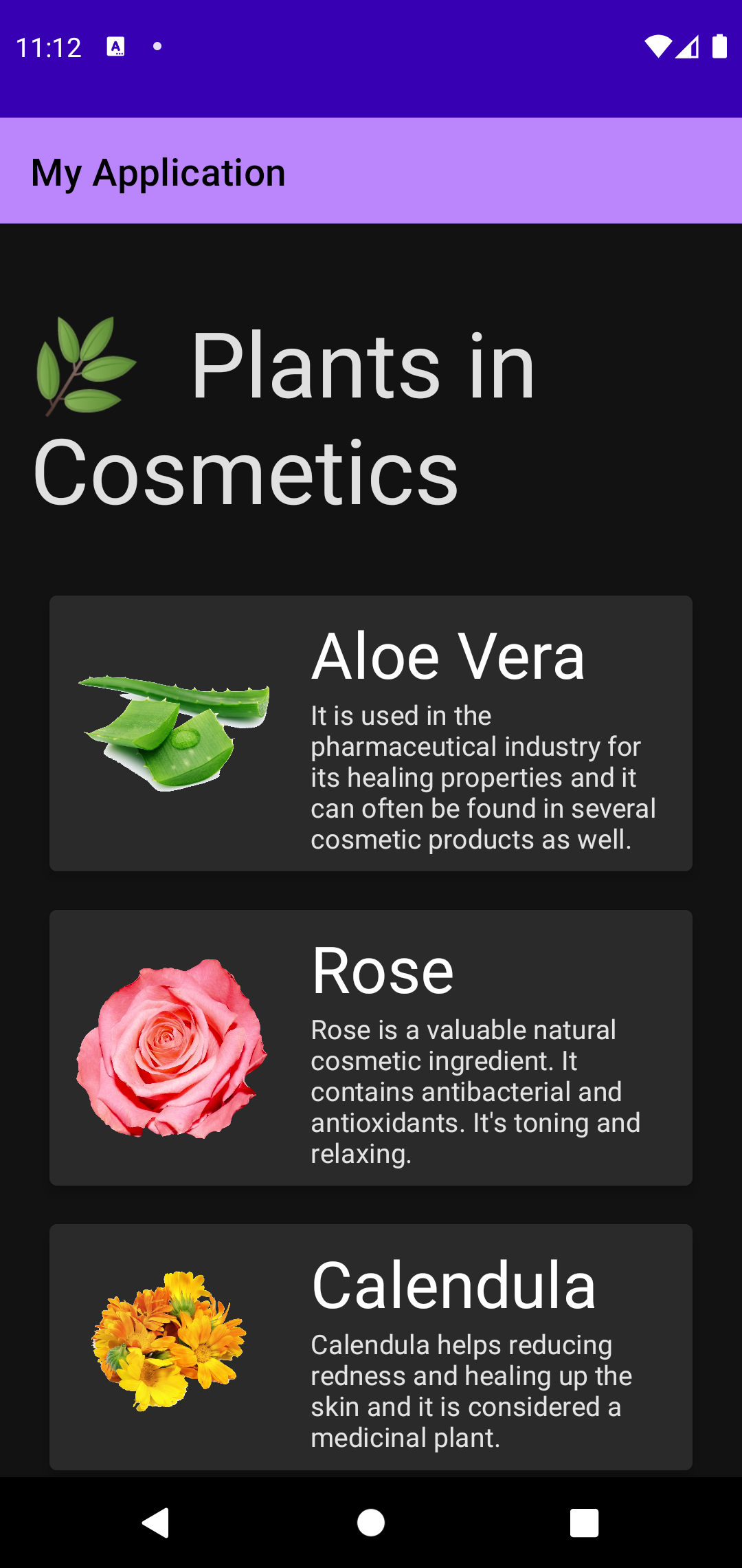 Current app in dark theme | 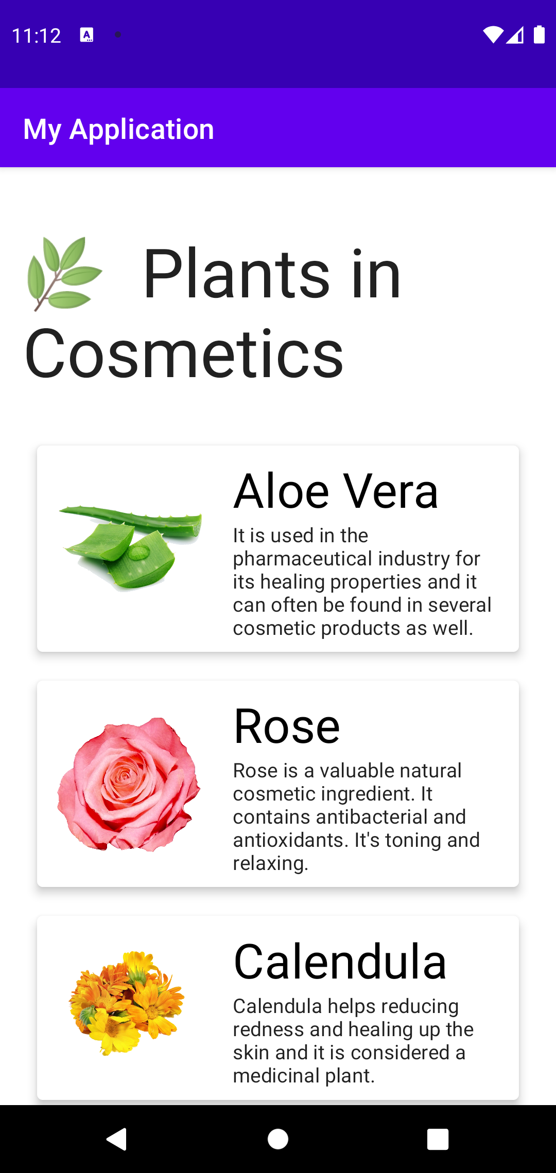 Current app in light theme |
|---|
Step 5: Color system
In all applications, we have a color scheme, and these colors give the application a distinctive look.
The color scheme consists of a primary color and a secondary color among other colors for surface, background, and error for each theme. In the day/light theme, the colors are clear and bright and in the night/dark theme, the colors are calming and cozy to reduce eyestrain.
This Material palette generator by Material Design will help you generate suitable colors for your app.
val teal700 = Color(0xFF00796B)
Jetpack Compose uses Hexadecimal for the color format but we replace the hash # with 0x so that the compiler knows that this is a color. Then, FF is responsible for color transparency. FF means opaque and the transparency for that is 100%.
After that, the six hexadecimal digits two each for the red, green, and blue components, in that order.
This is a helpful link to David Walsh’s blog, in which there is a table of each symbol with the corresponding percentage of transparency. Replace “FF” with the mentioned symbol based on the desired transparency.
In our plants app, let’s start customizing the app by first changing the colors. We will use mostly dark teal and light teal colors.
Color.kt
Go to, theme folder in your app package. Then, open the color.kt file and add those two colors:
val teal700 = Color(0xFF00796b) val tealDark = Color(0xFF004c40)
After doing this, nothing will change in our app because we are still referencing the old predefined colors. To change that, we need to modify the theme.kt file.
Step 6: Themes
For our app theme, we want the dark teal color as a primary variant color. And the light teal color as a primary color.
Let’s take a look at the color palette in the theme.kt file.
Theme.kt
There are two different palettes, darkColors() and lightColors() with parameters set to the default values we mentioned in the baseline theme.
We can use predefined colors which include black, dark gray, gray, light gray, white, red, green, blue, yellow, cyan, magenta, and transparent.
We want our color palette with the below colors:
- The primary will be used for the app bar.
- The primary variant will be used for the status bar.
- The background will be used for the app background as a whole.
- The surface will be used for the plant card.
- On primary will be used for the text written on top of an object that uses the primary color.
private val DarkColorPalette = darkColors( primary = teal700, primaryVariant =
tealDark, background = Color.DarkGray, surface = Color.DarkGray, onPrimary =
Color.White, ) private val LightColorPalette = lightColors( primary = teal700,
primaryVariant = tealDark, onPrimary = Color.White, )
You can notice a function with your application name under the palette. This function by default takes two parameters -this can change and be customized even further-.
Those parameters are a darkTheme of a boolean type to read if the Android OS is in the dark theme or not. The second parameter takes a content as a composable function.
Inside this function, we set different color palettes based on the darkTheme value which will perform a recomposition if this value changed.
After that, we can see MaterialTheme() which is part of Jetpack Compose. This composable is responsible for the whole app theme and it takes colors, typography, shapes, and content. The code is generated for passing our colors, type, shape, and content.
As for the content, it’s defined in the MainActivity.
MainActivity.kt
Before running our app, let’s set our status bar to take the primary variant color we defined earlier by adding this line inside our theme composable:
CosmeticsPlantsTheme { window.statusBarColor =
MaterialTheme.colors.primaryVariant.toArgb() … }
Let’s run the app and see. It should look like this:
 The new dark colors | 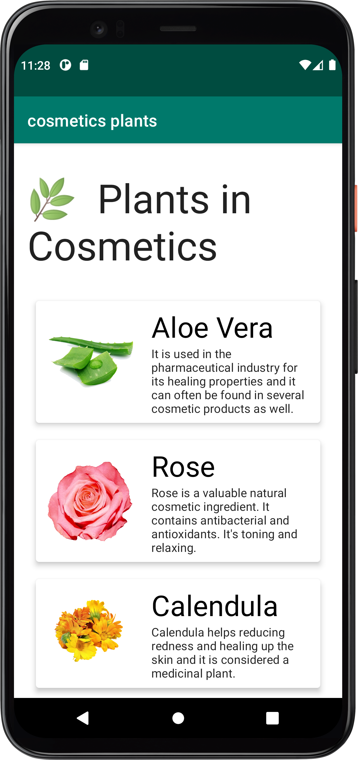 The new light colors |
|---|
Step 7: Type system
In our application, we will use two different fonts, Caveat and Barlow Condensed. You can download them from Google Fonts.
Note: Based on Android Developers documentation, Jetpack Compose supports only bundled font resources that come in .ttf format and does not support downloadable fonts.
Add fonts to your project
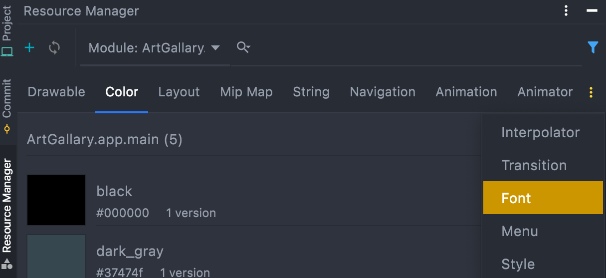
From resource manager
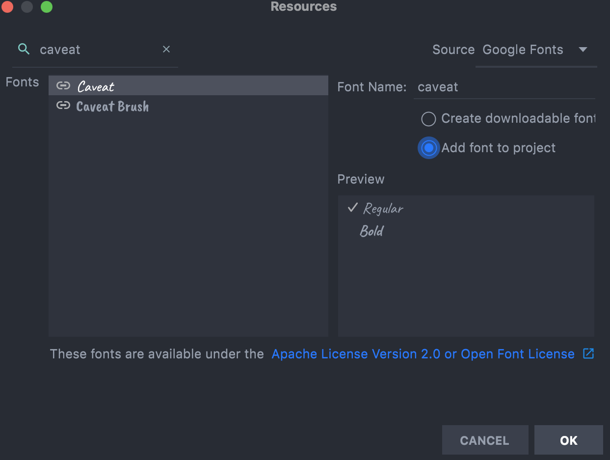
Go to the resource manager in Android Studio and click on three dots and choose Font.
Then, the Font tab will open so click on the plus (+) button to add more fonts. A list of fonts will appear to choose fonts from there.
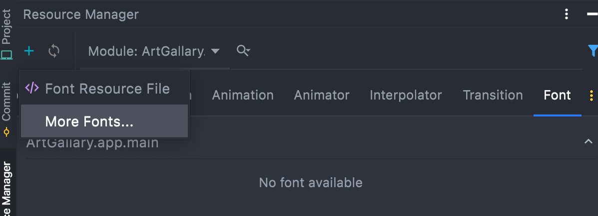
Search for “caveat” and make sure you change the font option to “Add font to project” because downloadable fonts are not supported as we mentioned.
From an external source
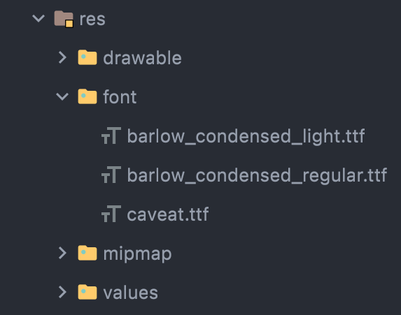
Let’s download the second font “Barlow Condensed” from Google Fonts. Unzip the downloaded file and change the names for the light and the regular .ttf files to a name without spaces or capital letters. After that, drag both fonts -regular and light- to the font folder in the res folder in Android Studio.
Now, we are ready for the next step which is to use those fonts in Type.kt file.
Type.kt
Here, we need to define the font family for each font we added. This function takes a list of different weights for each font as a parameter to load the corresponding font from the resource folder. For Caveat, we downloaded the regular font so the weight will be FontWeight.Normal. For Barlow, we downloaded the regular and the light so it will be FontWeight.Light and FontWeight.Normal.
Your code should look like this:
private val Caveat = FontFamily( Font(R.font.caveat, FontWeight.Normal) )
private val Barlow = FontFamily( Font(R.font.barlow_condensed_light,
FontWeight.Light), Font( R.font.barlow_condensed_regular, FontWeight.Normal ) )
Now, we have font family values without using them. To use them, we need to set the font family in TextStyle() function.
In our plants app, the text scales that are displayed are h1, h2, and body2. Let’s write the code below to set the font family, font weight, font size, and text alignment:
// Set of Material typography styles to start with val Typography = Typography(
h1 = TextStyle( fontFamily = Barlow, fontWeight = FontWeight.Light, fontSize =
30.sp, textAlign = TextAlign.Center ), h2 = TextStyle( fontFamily = Caveat,
fontWeight = FontWeight.Normal, fontSize = 20.sp, textAlign = TextAlign.Center
), body2 = TextStyle( fontFamily = Barlow, fontWeight = FontWeight.Normal,
fontSize = 16.sp, textAlign = TextAlign.Left ), )
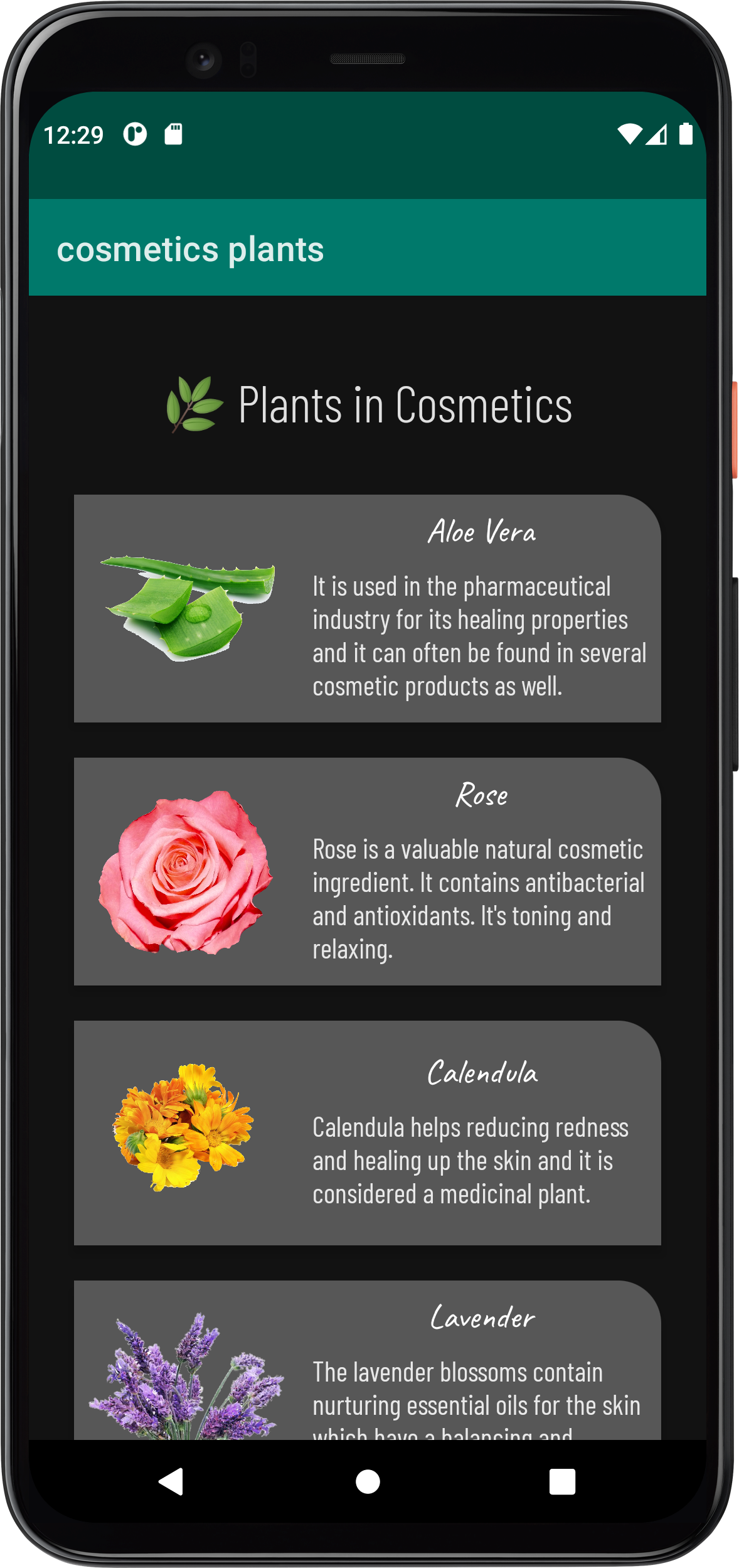
This is what you will see when you run the app. It’s good but it will be great if we modified the shape of the cards also.
 Fonts in dark theme |  Fonts in light theme |
|---|
Step 8: Shapes system
Click on the Shape.kt file to see the default values for the shapes.
Shape.kt
Change the medium value to take a round corner with 25 dp from the top end only, like this:
val Shapes = Shapes( small = RoundedCornerShape(4.dp), medium =
RoundedCornerShape(topEnd = 25.dp), large = CutCornerShape(topStart = 50.dp) )
Now, run the app to see your fully customized app theme.
 Cards shape in dark theme | 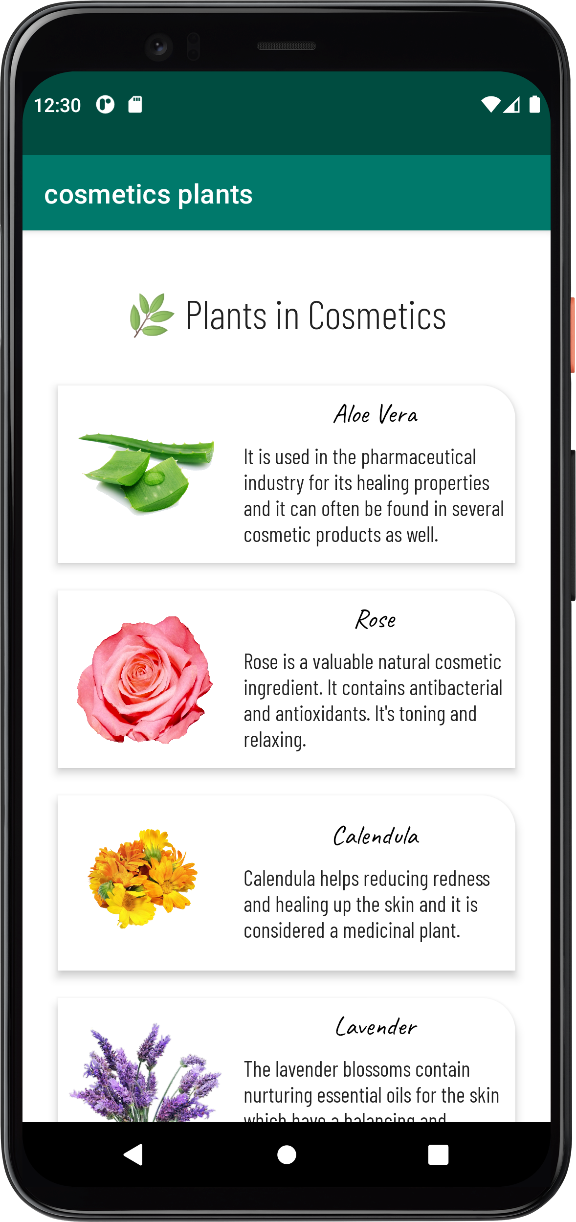 Cards shape in light theme |
|---|
Result
This is the final result for this application in both light and dark mode.
Full app in dark theme | Full app in light theme |
|---|
🔗 The full code on GitHub
Conclusion
In this blog, we continued building our app that displays plants used in cosmetics. Along the way, we learned what is the baseline them. We mentioned important notes about dark and light themes, the color system, the type system, and the shape system.
🍀 If this was helpful to you, please, share and show support!