Lists using LazyColumn in Jetpack Compose
- Part one: Lists using LazyColumn in Jetpack Compose.
- Part two: Customize application theme using Jetpack Compose.
Before Jetpack Compose, we used to create a RecyclerView and an Adapter to show a large set of lists. Now, we can use LazyColumn or LazyRow to show a large set of lists vertically or horizontally with few lines of code as we will demonstrate in this blog.
If you want to read the Arabic version of this tutorial, you can read it here
What you’ll build
In order to understand more, we will build an application that displays a list of natural plants used in cosmetics and skincare.
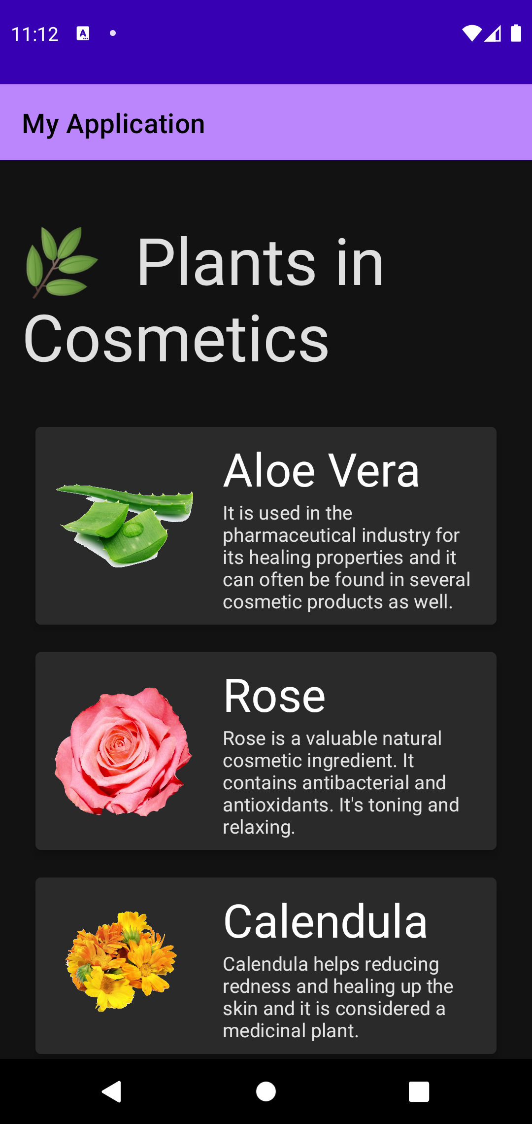 The final result (dark theme) | 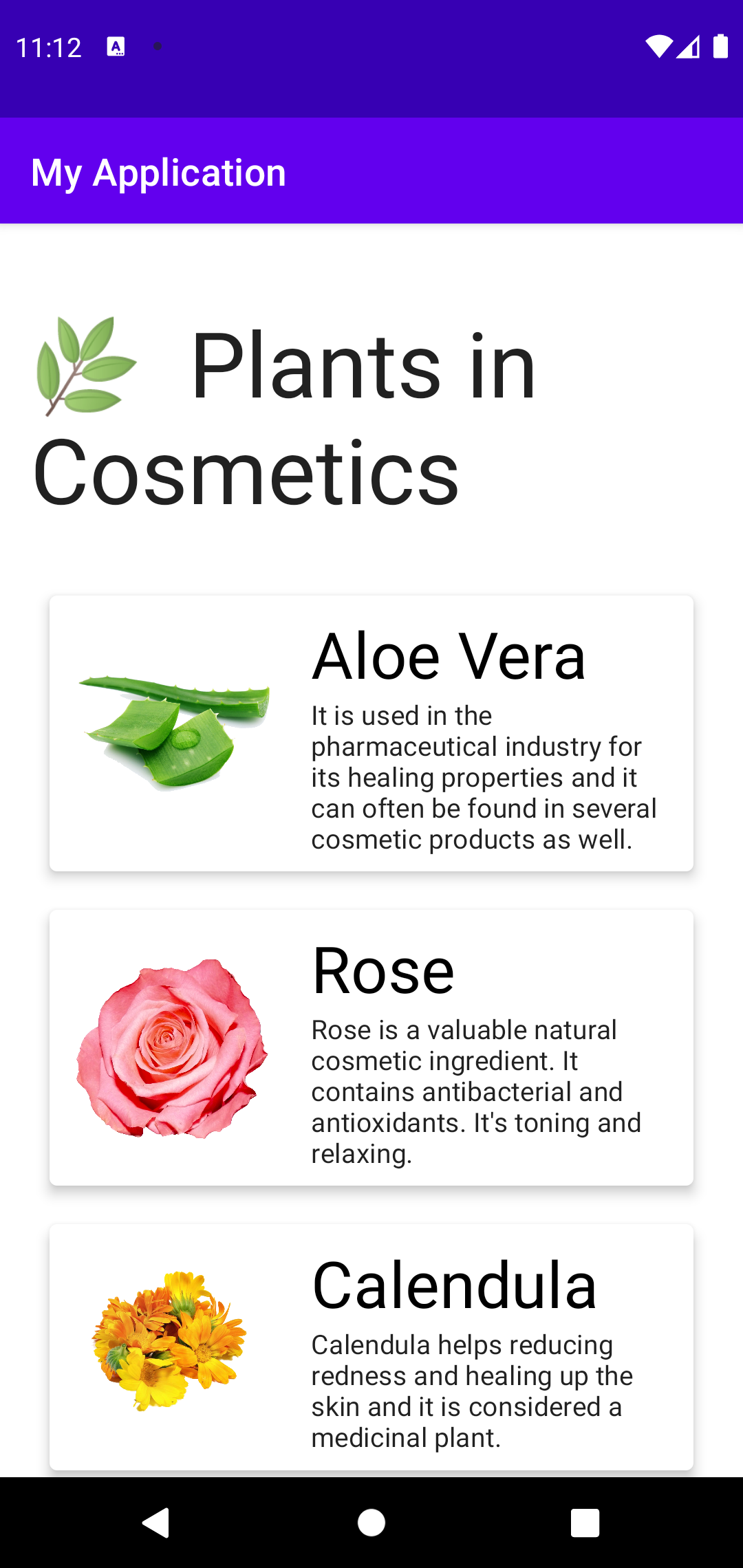 The final result (light theme) |
|---|
Step 1: Create the app
Open latest Android Studio -> new project -> choose “Empty Compose Activity” from phone and tablet templates -> type [your project’s name].
Step 2: Add fake data for the display
First, create a Plant data class that has an ID, a name, a description, and an image resource. The image resource will be an integer type because we will be referencing the ID of the picture using R class.
Start creating the data class by adding a new Kotlin class/file -> data class -> Plant. The data class should contain the following code:
data class Plant(
   val id: Int,
   val name: String,
   val description: String,
   val imageRes: Int
)
Second, create a new Kotlin class/file -> file -> Plants. Inside that file, copy the following list of plants here. You will see an unresolved reference error in the imageRes value which will be gone after importing the corresponding images in the next step.
Third, download the plant’s images from this link. Inside Android Studio, go to the “Resource Manager” -> in the Drawable tab click on the plus “+” button -> choose “import drawables” -> choose the 12 images downloaded previously on your device -> click import.
Step 3: UI development
MainActivity.kt
Let’s get back to the “MainActivity” and remove the “Greeting” function and its calls from the app theme and the preview function.
Call “AllPlants” Composable which you will declare in a moment. Pass the “Plants” list inside “AllPlants”. It would look something like this:
class MainActivity : ComponentActivity() {
   override fun onCreate(savedInstanceState: Bundle?) {
       super.onCreate(savedInstanceState)
       setContent {
           YOUR_APP_NAME_Theme {
               Surface(color = MaterialTheme.colors.background) {
                   AllPlants(plants)
               }
           }
       }
   }
}
AllPlants.kt
Add a new Kotlin class/file -> file -> AllPlant
Inside that file, write “AllPlants” composable function which takes a list of Plants to be displayed later using LazyColumn. For now, your code should be like this:
@Composable
fun AllPlants(platList: List<Plant>) {}
For this application, we want a normal app bar displaying the app name. Then, under it, we want a list of plants with their information.
To make this, let’s use “Scaffold” composable which allows us to divide the screen into an app bar and a body content.
Scaffold composable takes a topBar parameter which can be a Composable function. For that, use the predefined TopAppBar composable function which also takes parameters to control what and how to display it.
From these parameters, specify the background color of the TopAppBar to be the primary color of the application. Also, the title which takes a Composable function so we will give it a Text composable. One thing to note here about Text composable is that it takes a hardcoded text value or a dynamic one defined as a String resource which helps with the app localization. We will use the second approach to retrieve the app name.
To apply the above in practice it should look like this:
@Composable
fun AllPlants(platList: List<Plant>) {
   Scaffold(
       topBar = {
           TopAppBar(
               backgroundColor = MaterialTheme.colors.primary,
               title = { Text(stringResource(R.string.app_name)) }
           )
       }
   ) {}
}
Now that the app bar is ready, let’s move to the body content under it. For the body content, we will define a title item and a list of plant items.
For displaying a long list of items it’s recommended to use LazyColumn or LazyRow. For our case, we want to present our list vertically so we will use LazyColumn.
We want this list to take as much space available after the padding so we’ll set the width to be fillMaxWidth using Modifier.
Also, we will add a 16.dp padding to the content using ContentPadding so it does not stick to the edges of the screen. Your code should look like this:
@Composable
fun AllPlants(platList: List<Plant>) {
   Scaffold(
       topBar = {
           TopAppBar(
               backgroundColor = MaterialTheme.colors.primary,
               title = { Text(stringResource(R.string.app_name)) }
           )
       }
   ) {
       LazyColumn(
           modifier = Modifier.fillMaxWidth(),
           contentPadding = PaddingValues(16.dp)
       ) {}
   }
}
Inside the LazyColumn composable, we can define a single item that takes a composable.
 Text header (dark theme) |  Text header (light theme) |
|---|
To practice this, let’s use “item” inside LazyColumn and add a row that takes the remaining maximum width space and vertical padding of 25.dp.
Rows allow us to align content inside them to the end, start, or center. We can also specify a horizontalArrangement which is the horizontal arrangement of the row children, and a verticalAlignment which is the vertical alignment of the row children. Let that be a centered value. Your code should look like this:
LazyColumn(
   modifier = Modifier.fillMaxWidth(),
   contentPadding = PaddingValues(16.dp)
) {
   item {
       Row(
           modifier = Modifier.fillMaxWidth()
               .wrapContentHeight()
               .padding(vertical = 25.dp),
           horizontalArrangement = Arrangement.Center,
           verticalAlignment = Alignment.CenterVertically
       ) {}
   }
}
Inside Row, we should specify a Text to display a title before the plants list. This text will have a heading 3 style from MaterialTheme.
LazyColumn(
   modifier = Modifier.fillMaxWidth(),
   contentPadding = PaddingValues(16.dp)
) {
   item {
       Row(
           modifier = Modifier.fillMaxWidth()
               .wrapContentHeight()
               .padding(vertical = 25.dp),
           horizontalArrangement = Arrangement.Center,
           verticalAlignment = Alignment.CenterVertically
       ) {
           Text(
               "\uD83C\uDF3F  Plants in Cosmetics",
               style = MaterialTheme.typography.h3
           )
       }
   }
}
In addition to item inside LazyColumn, we can define items which takes a data list and display each list element into a composable. We will pass the plant list coming from the MainActivity as a data list for items().
For each plant, we will display the information in a PlantCard which is a customized composable we will build in the next step.
Inside PlantCard, we need to pass the plant name, description, and image so we can display them. After applying what we mentioned, your code should look like this:
@Composable
fun AllPlants(platList: List<Plant>) {
   Scaffold(
       topBar = {
           TopAppBar(
               backgroundColor = MaterialTheme.colors.primary,
               title = { Text(stringResource(R.string.app_name)) }
           )
       }
   ) {
       LazyColumn(
           modifier = Modifier.fillMaxWidth(),
           contentPadding = PaddingValues(16.dp)
       ) {
           item {
               Row(
                   modifier = Modifier.fillMaxWidth()
                       .wrapContentHeight()
                       .padding(vertical = 25.dp),
                   horizontalArrangement = Arrangement.Center,
                   verticalAlignment = Alignment.CenterVertically
               ) {
                   Text(
                       "\uD83C\uDF3F  Plants in Cosmetics",
                       style = MaterialTheme.typography.h3
                   )
               }
           }
           items(platList) { plant ->
               PlantCard(plant.name, plant.description, plant.imageRes)
           }
       }
   }
}
PlantCard.kt
Add a new Kotlin class/file -> file -> PlantCard
Inside that file, write “PlantCard” composable function with the parameters we passed previously in AllPlant file. Like this:
@Composable
fun PlantCard(name: String, description: String, image: Int) {}
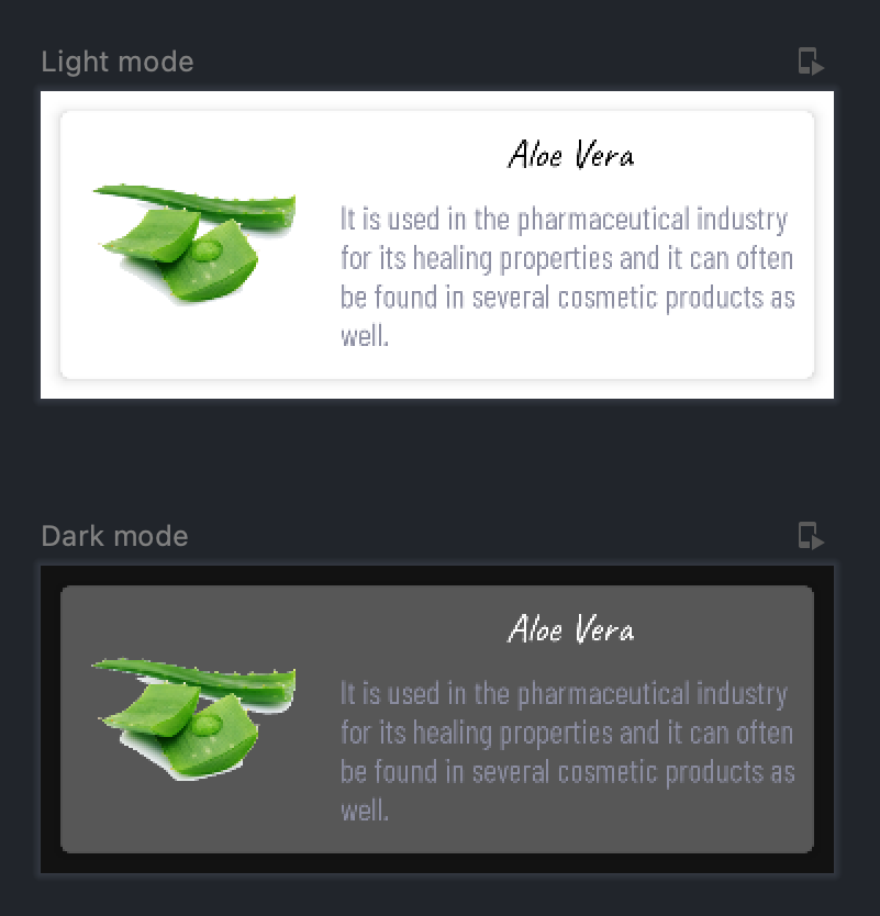
Plant card
To create the above design, we will use a Card composable. Set the appearance for this card using Modifier to have 10.dp padding value from all sides and to take the remaining maximum width after the padding.
For the height, we will use wrap content because some cards have longer content than others.
To specify the card shape, we should use the shapes from MaterialTheme which we will customize later in the next blog. For now, let’s choose a medium shape.
Elevation controls the size of the shadow below the card. Let’s specify 5.dp for the elevation parameter.
We should also specify the card background color to take a value from MaterialTheme which we will mention customizing in the next blog.
Your code should look like this:
@Composable
fun PlantCard(name: String, description: String, image: Int) {
   Card(
       modifier = Modifier
           // The space between each card and the other
           .padding(10.dp)
           .fillMaxWidth()
           .wrapContentHeight(),
       shape = MaterialTheme.shapes.medium,
       elevation = 5.dp,
       backgroundColor = MaterialTheme.colors.surface
   ) {}
}
In the above design, we can convert the Card content into a Row() with an Image() and a column(). The column displays two texts vertically -the name and the description of the plant-.
Let’s start with the Image composable which displays an image on the screen. It takes a painter parameter -for png and jpg- which can be a hardcoded value of an image or it can be retrieved from the resources folder using painterResource(image). We are already passing the imageRes ID from AllPlants so we can use it here.
Adding a contentDescription is a must for accessibility.
We also have to specify the size of the image to ensure it’s displayed correctly. Let’s give it a 130.dp size and an 8.dp padding using Modifier.
contentScale should be FIT to display the whole image inside the defined size. Image code should look like this:
@Composable
fun PlantCard(name: String, description: String, image: Int) {
   Card(
       modifier = Modifier.padding(10.dp)
           .fillMaxWidth()
           .wrapContentHeight(),
       shape = MaterialTheme.shapes.medium,
       elevation = 5.dp,
       backgroundColor = MaterialTheme.colors.surface
   ) {
       Row(
           verticalAlignment = Alignment.CenterVertically,
       ) {
           Image(
               painter = painterResource(id = image),
               contentDescription = null,
               modifier = Modifier.size(130.dp)
                   .padding(8.dp),
               contentScale = ContentScale.Fit,
           )
       }
   }
}
Next to the Image, we want to present text vertically using a Column composable with 8.dp padding using Modifier.
Then, add a Text composable which takes the plant name that is passed in AllPlant file, and set the text style to be heading 4.
Add another Text composable which takes the plant description that is passed in AllPlant file, and set the text style to be body 2. Applying this to your code should look like this:
@Composable
fun PlantCard(name: String, description: String, image: Int) {
   Card(
       modifier = Modifier.padding(10.dp)
           .fillMaxWidth()
           .wrapContentHeight(),
       shape = MaterialTheme.shapes.medium,
       elevation = 5.dp,
       backgroundColor = MaterialTheme.colors.surface
   ) {
       Row(
           verticalAlignment = Alignment.CenterVertically,
       ) {
           Image(
               painter = painterResource(id = image),
               contentDescription = null,
               modifier = Modifier.size(130.dp)
                   .padding(8.dp),
               contentScale = ContentScale.Fit,
           )
           Column(Modifier.padding(8.dp)) {
               Text(
                   text = name,
                   style = MaterialTheme.typography.h4,
                   color = MaterialTheme.colors.onSurface,
               )
               Text(
                   text = description,
                   style = MaterialTheme.typography.body2,
               )
           }
       }
   }
}
Result
This is the final result for this application in both light and dark mode.
The final result (dark theme) | The final result (light theme) |
|---|
👩💻 The full code on GitHub
Conclusion
In this blog, we learned how to display a list of items using LazyColumn. Along the way, we dealt with multiple essential comparables to build such UI. Next, we will explain customizing themes in Jetpack Compose using this application.